6 tips to help you choose the colors for your walls

The color of your walls can have a huge impact on the mood and atmosphere of your home. The right colors can make your space feel more peaceful, happy, or even romantic depending on what you're going for. In this blog post, we will go over 6 tips that will help you choose the perfect colors for any room of your house!
Consider The Mood You Want To Create
You have to be careful when choosing the colors for your walls because you want them to create a specific mood. For example, if you are trying to set up an inviting or relaxing atmosphere in your home then pastel shades would work well depending on how much natural light is available in the room. If you are looking for something more vibrant and fun, brightly colored accent pieces can help achieve this effect while adding dimension to the space at the same time. However, keep in mind that these color tones should not match exactly with what is already hanging on the wall since they could look awkward instead of blending into one another seamlessly which you can achieve by contacting painters operating in East London that can help you with your color choices! Therefore if there are several pictures hung up on the wall, consider choosing colors that compliment them well. For example, if you like the idea of having neutrals with pops of reds and oranges but do not know where to start then paint swatches similar to this in various shades can serve as an easy starting point.
How Much Light Is In The Room
Color schemes for rooms with a lot of natural light are usually brighter and more vivid because it helps reflect all the colors around. This would work well if you want to make an impression on your guests as soon as they walk through the door since vibrant color tones can do this easily especially in large open spaces like living rooms or kitchens. However, if there is not enough natural lighting then you should stick to darker shades that will absorb what little light comes into the room instead of reflecting outwards which results in a dull look. It might be helpful to take some photos of what you have planned for each wall and compare them against how much ambient (natural) light enters every nook and cranny throughout different times of the day to see which colors stand out most.
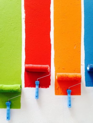
How Much Of The Wall Is Visible
This is a particularly important consideration if you're uncertain about your color choices, as it will help to narrow down the options available. For example, in rooms with low ceilings and minimal natural lighting (e.g., small or darker spaces), bright colors may not be the best idea; they might make the room appear even smaller than it already is. On an average-sized wall, however—a large enough space to see only one accent stripe before moving on to another area of the house—it's okay to have brighter tones that'll draw attention without being overwhelming. Adding some spice into otherwise boring areas can bring life back into them! If there are multiple walls involved in this situation though, then avoid opting for two contrasting colors that are too bold. Instead, choose one main color that's high-contrast and complement it with a softer tone for the second accent stripe to avoid making your walls look choppy.
Example: For low ceilings or rooms without much natural light, bright colors might make the room appear even smaller than it already is. On an average-sized wall (where only one accent stripe can be seen before moving on to another area of the house), brighter tones draw attention without being overwhelming; they're okay as long as there aren't multiple walls involved. When choosing two contrasting colors, however, make sure they're not both too bold and instead use a main high-contrast color and compliment it with a softer tone for the second accent stripe.
Consider A Color Scheme
Before picking out a color scheme, whether it be for the walls or home decorations, you need to take some time and think about what looks best. Color schemes can range from bold colors like reds and purples that attract attention to more subtle tones such as creams and grays that help set the mood of your space. Whatever color scheme you end up choosing make sure they go well together because having different shades of the same hue throughout the room is going to look pretty strange (and not in a good way).
As with most things when starting on an unknown path consider using pictures online as reference points; especially since Pinterest has thousands upon thousands of photos featuring rooms full of inspiration! You can get inspiration from a color scheme of another room in your house, or you could even use paint chips. For example, if you have an accent wall that is orange and want to tie it into the kitchen walls - choose shades of green for the kitchen walls. Or if you love blue but don't know how to work it into a room with pink accents then choose colors that are close tones of each other such as turquoise and aqua which are both blue so they will tie the two colors together.
How To Incorporate Color Into Your Walls
If you're looking to add a pop of color without going all out on painting your room there are other options. You can choose a paint that is the same hue as the wall but in different sheens such as flat, satin, or semi-gloss - this will help make it look like more than just one shade. If you want to go bolder with colors then try choosing wallpaper for smaller areas and accent walls which oftentimes come in brighter shades. This way if they don't work out quite right after getting them up on the wall you'll only be left with a small section rather than an entire room's worth! Or simply opt for using colored lights instead by adding lamps or string lighting to your room.
What Colors Should You Not Choose?
Despite what some might say about it being a good idea to pick out colors that contrast with each other, this is not the best choice. When picking out paint for your walls you want them to work well together and have continuity - especially if they're going on opposite sides of the room! What happens when you put these contrasting hues next to one another: purple and yellow (which can look like green sometimes). If you really cannot stand having two different shades side by side then try using wallpaper or wall decor instead; which will help bring in more color without ruining your design plan.
Certain colors go better with specific types of home décor such as neutrals for country homes since they are more simplistic. You can go with deep bold colors for industrial or modern homes because this is what they're known for. And you could also use lighter, neutral tones if your home has an earthy feel to it so that way the room doesn't look too stark and boring!

If you are having trouble deciding on the perfect color to paint your walls, consider these tips before making a final decision. This way, when choosing colors for your home, you can choose one that fits with how much space there is in total. If all four walls are different sizes or shapes, then be sure to find three commonalities between them so they flow well together no matter which color combination you go with.